Interview
It Began with Madame de Pompadour
Cindy Sherman in front of her work, Untitled (#216) (1989), at Skarstedt Gallery, New York, 2008. Production still from the Art in the Twenty-First Century Season 5 episode, Transformation. © Art21, Inc. 2009.
In 2008, twenty of Cindy Sherman’s History Portraits (1989–1990) were exhibited at Skarstedt Gallery in New York City. In the following interview, Sherman walks Art21 through the exhibition and discusses the ideas behind individual photographs as well as the overall series.
ART21: What was the impetus for History Portraits?
SHERMAN: This piece [Untitled (#183 A)] was sort of where it all began. In the late ‘80s I was invited to do something with a company that wanted artists to make objects that were functional yet works of art. They suggested I do something with Limoges and invited me to their factory where they had casts of everything they’d ever done. They had a lot of things that Madame de Pompadour had designed when she was involved with King Louis XV. I decided to use a tureen that was made for her and I shot all these pictures loosely based on her.
ART21: Is this Madame herself or is this your idea of her?
SHERMAN: Like everything I do, I wasn’t really trying to copy any picture of Madame de Pompadour, but to look like someone like Madame de Pompadour. A year after I made this I had a show in Paris that coincided with a big celebration of the French Revolution. And so in continuing the theme of the Madame de Pompadour, I did a whole series of characters that were inspired by my research of the Revolution and that whole period. And I started doing more poses as men.
ART21: What were some of the challenges of portraying a man?
SHERMAN: I hadn’t done too many characters that were supposed to be men. I had tried in some of the black and white photographs but they weren’t successful. In doing this work I realized it was not so hard visually—with makeup, wigs, and costumes—to make myself look like a man. What was easier in these pictures that was harder in earlier work was that I wasn’t trying to show any emotion. These characters are just sitting there kind of frozen in time. Whereas the new work is so much about a kind of emotion that comes out of the face, from behind the makeup I’ve put on.
Cindy Sherman in front of her work, “Untitled (#214)” (1989), at Skarstedt Gallery, New York, 2008. Production still from the “Art in the Twenty-First Century” Season 5 episode, “Transformation,” 2009. © Art21, Inc. 2009.
ART21: Tell me more about your research.
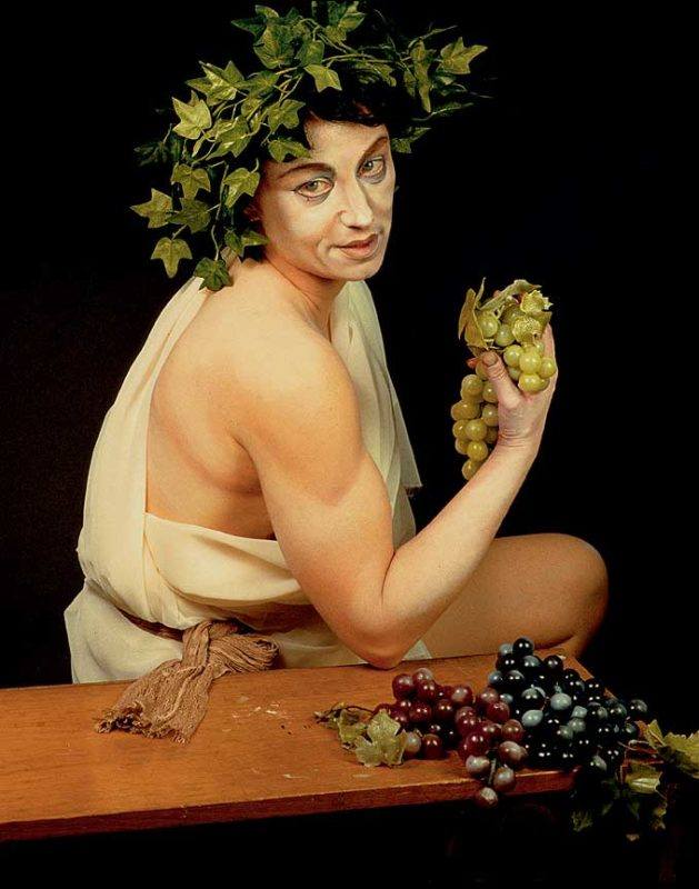
SHERMAN: I usually buy a lot of books and rip pages out and stick them on the wall. I refer to them in more encyclopedic ways and it just sort of all gets absorbed. Then, when I’m ready to shoot, I’ll see what I have available. I think with [Untitled (#224)] I had all these grapes and leaves and thought, “That’s such an easy thing to do, to copy Caravaggio’s Sick Bacchus.”
When I was in Rome, I would go to the flea markets there because I didn’t bring that many costumes and props with me. I expected to buy things there. The sleeves in [Untitled (#209)] were ripped off of a dress and added to the bodice of something else. And the white part is just a shirt that I sort of tucked in. I probably saw some painting with a crisscross thing on the head somewhere and threw that in too. I wasn’t copying anything in particular.
Cindy Sherman, “Untitled (#224),” 1990. Color photograph; 48 × 38 inches. Edition of 6. © Cindy Sherman. Courtesy Metro Pictures, New York.
ART21: It seems to me that people think mostly about your work in terms of the creation of another personality or figure. But are you also thinking about the creation of an atmosphere?
SHERMAN: Yes. In some, I set up a background behind me and try to make it seem like the environments these people were living in. If I’m shooting in an interesting place, I will use already existing parts of the room to create an atmosphere, for example, the wall behind the character in [Untitled (#210)]. But in other places, like in my studio where it’s not atmospheric, I will drape fabric and things behind me and try to create the atmosphere.
Cindy Sherman, “Untitled (#210),” detail, 1989. Color photograph; 75 × 53 inches. © Cindy Sherman. Courtesy Metro Pictures, New York.
ART21: Was there a portrait or artist you were thinking about when you were working on this piece [Untitled (#193)]?
SHERMAN: I think she was inspired by the idea of an older Madame de Pompadour or aging royalty or mistresses. I don’t think anybody even realizes that on the bottom right corner are these big toes on a huge foot. I thought, “What if she’s this beautiful powdered, wigged woman but then she’s got these big feet sticking out?” It’s one of the few jokey things in these pictures.
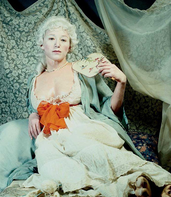
Cindy Sherman, “Untitled (#193),” 1989. Color photograph; 48 7/8 × 41 15/16 inches. Edition of 6. © Cindy Sherman. Courtesy Metro Pictures, New York.
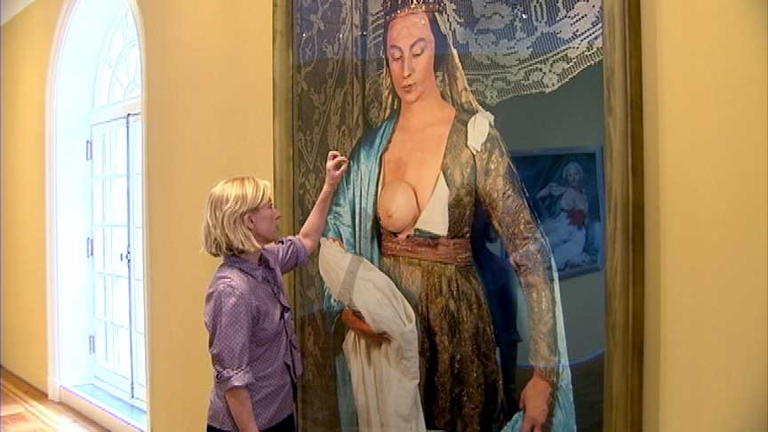
ART21: I think you have a tremendous amount of fun and there’s a lot of humor in your work yet people mostly take it very seriously. Tell me how you think about that.
SHERMAN: Well, I’m much more ignorant about Old Master paintings and art history than many people involved in the art world, so I’m not really taking it seriously. Like the tit in [Untitled (#216)] looks like a slice of half a grapefruit stuck onto someone’s chest and the baby looks plastic because it is. But in Old Master paintings a lot of these figures’ breasts don’t even look real or the children look muscular, like miniature wrestlers. I guess I’m also commenting on how we think these things are masterful. Why do we think they’re so great?
Cindy Sherman, “Untitled (#193),” detail, 1989. Color photograph; 48 7/8 × 41 15/16 inches. Edition of 6. © Cindy Sherman. Courtesy Metro Pictures, New York.
ART21: Is there any relationship between this work and the work showing at Metro Pictures?
SHERMAN: No. I think there’s a big difference. In these pictures I was trying to make it look like the characters had been sitting for a painter for days or weeks. There’s this sort of boredom I wanted them to have unlike with the pictures at Metro where there’s more of an immediacy, an urgency about those characters. Those characters are also about women getting older—women who are trying to show the fruits of their efforts in life but are not really comfortable with it, which is what you see underneath.
ART21: You were just looking at the surface of [Untitled (#216)]. What are you seeing there?
SHERMAN: I’m looking at pieces of dust that should have been airbrushed out [LAUGHS]. Since these were shot in 35-millimeter film, they’re not as sharp as the digital stuff. These are more painterly I guess. Nowadays, with digital printing, it’s so easy to make everything perfect, which is not always a good idea. Sometimes the mistakes are really what make a piece.
I was also thinking about how they’ve made a large inner negative in order to blow the picture up this big and so it preserves some of the details. There’s a lot of grain and yet the grain kind of works in its favor. If this had been shot with my digital camera, it would have a completely different effect; you would focus on globs of makeup and stuff like that. People are sort of focusing on that in the new work [at Metro Pictures] but that’s what part of that series is about—the wrinkles and that sort of thing.
Cindy Sherman in front of her work, “Untitled (#475)” (2008), at Metro Pictures, New York, 2008. Production still from the “Art in the Twenty-First Century” Season 5 episode, “Transformation,” 2009. © Art21, Inc. 2009.
ART21: Tell me about perfectionism.
SHERMAN: I’m definitely a perfectionist in terms of my work. And perhaps that’s why, when I’ve tried to use other models, even friends and family, I felt like it wasn’t successful. Though part of that’s because I had a hard time ordering them around and feeling like I could take advantage of their time that way. Working as an artist, I have a bit more freedom in terms of time and also the luxury of starting all over if I want to. A lot of the work is trial and error.
When I look back on early work I sometimes say, “Wow. That was really under-lit over here. Why didn’t I just know to do this or that?” I go back to things and think about how much I’ve learned since then. Some of the early work I do think is pretty dark, but I like it dark. Though in some cases it was the printing; back then the process was not so good. But I was also younger and more gullible I suppose. A lot of printers got away with saying, “This is the best we can do. We can’t bring out any more detail.” Even though I would look at the negative and say, “But I see more detail in there.” There’s a lot to be said for maturing in the work.
In the past, I never really cared about the quality of a print. I whipped them out because I wanted to play with the idea that art doesn’t have to be precious. But because these things sell for so much money now, I have to be a little bit more concerned about the quality, how the images hold up over time, how the frames are protecting them, and those sorts of things. Lately, we have been really concerned with the surface quality of the photograph, not even about the color, but just making sure the surface is perfect. It’s a little crazy.
Interviewer: Susan Sollins. Content Editor: Nicole J. Caruth. Published: July 2013. © Art21, Inc. Artwork Courtesy: Metro Pictures.